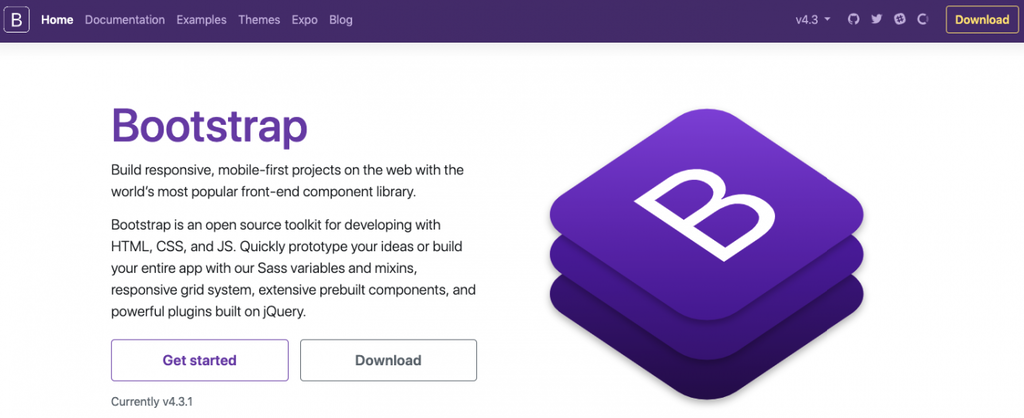
Bootstrap has been a popular front-end development framework since its initial release in 2011. It has gained a massive following among web developers due to its ease of use, flexibility, and powerful features. As the internet continues to evolve, so does the need for responsive and user-friendly websites. Bootstrap has played a significant role in meeting these demands, making it one of the most widely used frameworks in the world.
In this article, we will delve into the world of Bootstrap and explore its evolution, features, and benefits. We will also discuss its impact on modern web development and how it has revolutionized the way we design and build websites. So let’s dive in and discover what makes Bootstrap a game-changer in the tech industry.
The Birth and Growth of Bootstrap
Born out of Twitter, Bootstrap was initially known as “Twitter Blueprint,” a collection of CSS and HTML components developed by Mark Otto and Jacob Thornton in 2010. The primary purpose of Bootstrap was to provide consistent and reusable design elements that can be easily implemented across different projects. It aimed to streamline the process of developing web applications within Twitter, and it did an excellent job at it.
However, it wasn’t until August 2011 when Bootstrap was released as an open-source project on GitHub. This move made it accessible to the public, and it quickly gained traction among developers, thanks to its simplicity and efficiency. Since then, the Bootstrap team has been continuously updating and improving the framework, making it more robust and feature-rich with every new version.

Bootstrap originated from Twitter as “Twitter Blueprint,” a compilation of CSS and HTML elements created by Mark Otto and Jacob Thornton in 2010
The first official release, Bootstrap 2.0, came in January 2012, which brought significant changes and improvements to the framework. It introduced a responsive 12-column grid system, a redesigned base CSS, and a JavaScript plugin system for creating interactive components. This update played a crucial role in establishing Bootstrap as the go-to framework for creating modern and responsive websites.
In June 2013, Bootstrap 3.0 was released, bringing in a complete overhaul of the framework. It introduced a mobile-first approach, making Bootstrap fully responsive out of the box. It also replaced its previous icon font with an open-source one, Font Awesome, providing developers with a vast collection of vector icons to use in their projects. This update cemented Bootstrap’s position as the leading front-end development framework, with millions of websites using it.
The most recent and most significant update, Bootstrap 4.0, came after four years of development in January 2018. It brought in a ton of new features and improvements, including a revamped grid system, updated components, and added support for Flexbox. It also ditched the jQuery dependency, making it lighter and more flexible. The latest version of Bootstrap, 5.0, is currently in development, with a beta release expected soon.
The Features of Bootstrap
One of the primary reasons for Bootstrap’s popularity among developers is its extensive list of features. It provides a wide range of tools and components that can be easily implemented in any web project, regardless of its complexity. In this section, we will take a closer look at some of the essential features of Bootstrap and how they contribute to creating stunning and responsive websites.

Bootstrap is widely favored by developers largely due to its comprehensive array of features
Grid System
Bootstrap’s grid system is one of its defining features, allowing developers to create responsive layouts quickly. It consists of a 12-column grid that adapts to various screen sizes, making it ideal for designing websites that work seamlessly across all devices. This feature is especially useful in today’s world, where mobile devices have become the go-to option for browsing the internet.
The grid system utilizes CSS Flexbox, which provides better control over page layout and positioning of elements. It allows columns within a row to automatically adjust their size based on the device’s screen size, without any additional coding from the developer. This feature of Bootstrap makes it easy to create responsive and flexible designs that look great on all devices.
Pre-built Components
Bootstrap comes with a vast variety of pre-built components that can be easily integrated into a website. These components include buttons, tables, forms, navigation bars, drop-downs, and many more. They are highly customizable and come with predefined styles, making it easy to design and implement them into any project.
The components in Bootstrap are built using a combination of HTML, CSS, and JavaScript, which allows for greater flexibility in terms of design and functionality. They can also be easily extended using the numerous available plugins, making it possible to add new features and functionalities to existing components.
Responsive Design
With a mobile-first approach, Bootstrap ensures that every website built using the framework is fully responsive. It comes loaded with various classes that can be applied to elements to make them responsive. For instance, adding the “img-fluid” class to an image will make it responsive, automatically adjusting its size based on the device’s screen size.
Moreover, Bootstrap also provides specific classes and utilities for hiding or showing elements on different screen sizes. This feature is particularly useful for creating a consistent design across all devices while providing a better user experience. With Bootstrap’s responsive design, developers can focus on creating a single design that works seamlessly across all devices, saving time and effort.
The Benefits of Using Bootstrap
As we have seen, Bootstrap has an impressive list of features that make it one of the top choices for front-end development projects. But what sets it apart from other frameworks? In this section, we will explore the benefits of using Bootstrap and how it has transformed the web development industry.

Bootstrap offers a remarkable range of features, establishing it as a leading option for front-end development endeavors
Saves Time and Effort
One of the significant advantages of using Bootstrap is the time and effort it saves for developers. Its extensive library of pre-built components, as well as its grid system and responsive design, makes it possible to create a website quickly without having to write a lot of code from scratch. This feature is especially beneficial for smaller projects or when working on tight deadlines.
Bootstrap also provides consistent styling and design across all elements, which means developers don’t have to spend time designing and coding each component individually. With Bootstrap, developers can take advantage of its rich library of features and focus on customizing the design according to their needs.
Easy to Learn and Use
Bootstrap was designed with simplicity in mind, making it easy for both new and experienced developers to use. It comes with an extensive documentation that includes comprehensive guides, tutorials, and examples, making it easy to understand and implement. Moreover, Bootstrap’s intuitive naming convention makes it easy to remember and use its various classes and components.
Another significant advantage is that Bootstrap is compatible with all major browsers, meaning developers don’t have to worry about compatibility issues while using it. This feature is crucial for creating websites that work flawlessly across different devices and browsers, providing a seamless experience for users.
Customizable and Flexible
While Bootstrap comes with an extensive list of pre-built components, it also allows for customization and flexibility. Developers can easily modify the default styles or create custom themes to match the design requirements of their project. This feature makes it possible to create unique and stunning websites without compromising on functionality or responsiveness.
Furthermore, Bootstrap’s modular structure makes it easy to add or remove components according to the project’s needs. This flexibility allows developers to tailor their website design to their liking, making it stand out from others built using Bootstrap. With Bootstrap’s customization options, the possibilities are endless, making it suitable for any type of project, big or small.
The Impact of Bootstrap on Modern Web Development
Over the years, Bootstrap has had a massive impact on modern web development, reshaping the way websites are designed and built. Its easy-to-use features and responsive design have made it a go-to framework for developers worldwide, especially for those who work on tight deadlines or have limited resources.
Bootstrap’s popularity and widespread adoption have also led to the emergence of numerous templates and themes built using the framework. These ready-made templates provide developers with a solid foundation for their projects, allowing them to focus more on customizing the design rather than creating everything from scratch. This convenience has significantly contributed to Bootstrap’s growing popularity, making it an essential part of modern web development.
Moreover, Bootstrap’s community is actively involved in its development, regularly releasing updates and providing support to its users. This open-source approach has not only helped improve the framework but has also fostered a culture of learning and collaboration among developers. As a result, Bootstrap has become an integral part of the tech industry, shaping the future of web development.
Bootstrap vs. Other Front-end Frameworks
There are many front-end development frameworks available today, each with its unique features and benefits. However, Bootstrap has managed to stand out from the rest, thanks to its robust features and widespread adoption. In this section, we will compare Bootstrap with two other popular front-end frameworks, Foundation and Materialize, and see how they stack up against each other.
Bootstrap vs. Foundation
Foundation is another well-known front-end framework that follows a mobile-first approach in web development. Like Bootstrap, it provides a grid system, pre-built components, and customization options, making it a good alternative for developers. However, there are some key differences between Bootstrap and Foundation that make them suitable for different types of projects.
One of the significant differences is their grid systems. While Bootstrap uses a 12-column grid, Foundation uses a 16-column one, giving developers more options for designing complex layouts. Foundation also provides more layout options, including responsive menus and off-canvas layouts, which are not available in Bootstrap’s default grid system.
On the other hand, Bootstrap has a more comprehensive selection of pre-built components compared to Foundation. This feature makes it suitable for developing websites quickly, whereas Foundation may require additional coding for certain elements. Furthermore, Bootstrap offers better compatibility with older browsers compared to Foundation, making it a better choice for projects that require maximum browser support.
In terms of community and resources, Bootstrap has a larger following than Foundation, with more themes and templates available for developers to use. However, both frameworks have active communities and provide extensive documentation and support for their users.
Bootstrap vs. Materialize
Materialize is a front-end framework based on Google’s Material Design principles and guidelines. It offers a modern and sleek look and provides a set of pre-built components for creating responsive designs. Like Bootstrap, it also follows a mobile-first approach, making it ideal for developing websites for various devices.
One of the major differences between Bootstrap and Materialize is their design philosophy. While Bootstrap aims for a clean and minimalistic design, Materialize utilizes a more vibrant color scheme and shadows to add depth and visual appeal to its elements. This difference in design style makes them suitable for different types of projects, depending on the desired aesthetic.
Both Bootstrap and Materialize offer a similar set of features, including a grid system, pre-built components, and customization options. However, Materialize provides a text field validation feature, which requires less code to implement compared to Bootstrap. On the other hand, Bootstrap’s large community and vast library of resources make it a more popular choice among developers.
Tips for Using Bootstrap Effectively
Bootstrap is an excellent framework for developing modern and responsive websites, but like any other tool, it has its limitations. To make the most out of this powerful framework, here are some tips to keep in mind while working with Bootstrap.
Know Bootstrap’s Limitations
Bootstrap is a fantastic framework, but it’s not suitable for every project. It offers a rich set of features and components, making it ideal for creating standard websites with regular layouts and designs. However, if your project requires complex and unique designs, Bootstrap may not be the best choice.
Moreover, Bootstrap’s default styles can make all websites look similar, which can be a problem for businesses that need to stand out from their competitors. So before using Bootstrap, make sure you understand its limitations and determine whether it’s the right fit for your project.
Use Bootstrap Responsibly
While it’s tempting to use Bootstrap for everything, it’s essential to use it responsibly. Avoid using unnecessary components or plugins that may impact your website’s performance. Use only what you need and avoid overloading your site with too many elements. This practice will not only improve your website’s performance but also make it easier to maintain in the long run.
Customize Bootstrap
Bootstrap provides customization options, so take advantage of them to create a unique design for your website. Modify the default styles, change the color scheme, or add custom components to give your site a personal touch. By customizing Bootstrap, you can ensure that your website stands out from others built using the same framework.
Conclusion
Bootstrap has come a long way since its inception in 2011, evolving into one of the most popular front-end development frameworks in the world. Its extensive list of features, ease of use, and flexibility have made it an indispensable tool for web developers worldwide. From creating responsive designs to saving time and effort, Bootstrap has revolutionized the way websites are built, setting new standards for modern web development.
In this article, we explored the birth and growth of Bootstrap, its essential features and benefits, and how it has impacted modern web development. We also compared Bootstrap with other popular frameworks and provided some tips for using it effectively. As Bootstrap continues to evolve, there’s no doubt that it will continue to play a significant role in shaping the future of web development.
